G List
An end to end productivity app for recipes and meal planning.
7 min read
Role | UX/UI Designer
Duration | 4 Weeks
Tools Used | Figma, Photoshop, Marvel
The Issue at hand
Each week my wife builds a hand written meal plan and grocery list. This task is one of her least favorite things to do. She loves the outcome, but hates the process. How can I make this process easier for her? Is this in fact a problem for others? Would she benefit from a more automated approach to this task? I asked myself and others these questions and sought to find a solution that would benefit not only my wife but others like her experiencing the same problem.
Checking the shelves
Somebody must have already thought of this, right? That was my assumption. It seemed like such a universal problem. Millions of people shop at grocery stores everyday. How were they organizing this process? I have an app to help me sort my favorite golf courses, surely there would be something to make a simple grocery list.

Looking and asking
In fact there are many. The competitor research showed that many people have tried to solve this problem and user interviews told a similar story. Everyone had a way to make a list and get the things they needed from the grocery store.
What wasn’t obvious until all the data was laid out in front of me was how personal and customized this process really is? Every person had a slightly different way of approaching this problem and solving it for themselves. Some people make extensive lists either on paper or digitally and make sure they use each item they buy. Others make basically no list at all and rely on buying the same items over and over and use their cooking prowess to transform those items into delicious meals.
These extremes were reflected in the apps that are already out there. Some were detailed planners offering many online recipes to “spice up your week”. While others were geared towards the cooks and using the many different items they might have in their pantry.

The Presentation
As I do with all my projects, I took all the information gathered from the research phase and built a small presentation of the findings to help all involved parties have a visual representation of the information. I always find having this document helps bring the project to life and starts the process of defining the eventual UI style and feel.
Defining The Goals
The research pointed to 3 categories I needed to deal with in order to make the app as universal as possible.
- The List- Users need a way to list items they want to buy at the store. They want a way to share this list with other members of their household. They also want the ability to check off this list as they shop but still be able to see what the list holds for upcoming meals.
- The Recipes- Users want to make recipes. They mostly prefer recipes they are familiar with. They tend to keep those recipes in cookbooks and handwritten notes. They like to share recipes with their friends. They only want to try new recipes if they are easy to find and use ingredients they can typically get.
- The Meal Plan- All users have some kind of meal plan. Some of these plans are brand new each week changing out from hundreds of recipes. Some plans are the same 7 recipes repeated over and over. Regardless of what users did to plan, they all planned on some level.
The Architecture of Information
Here is where the app needed the work. How do I organize all this information into a format that could be used and customized by each individual? If everyone is so different is there really a way to please a majority? The competitor analysis had shown clearly that no one had found a way to organize the information in a way to please the users I had interviewed. I started with making a site map. This seemed like a useful way to find direction.

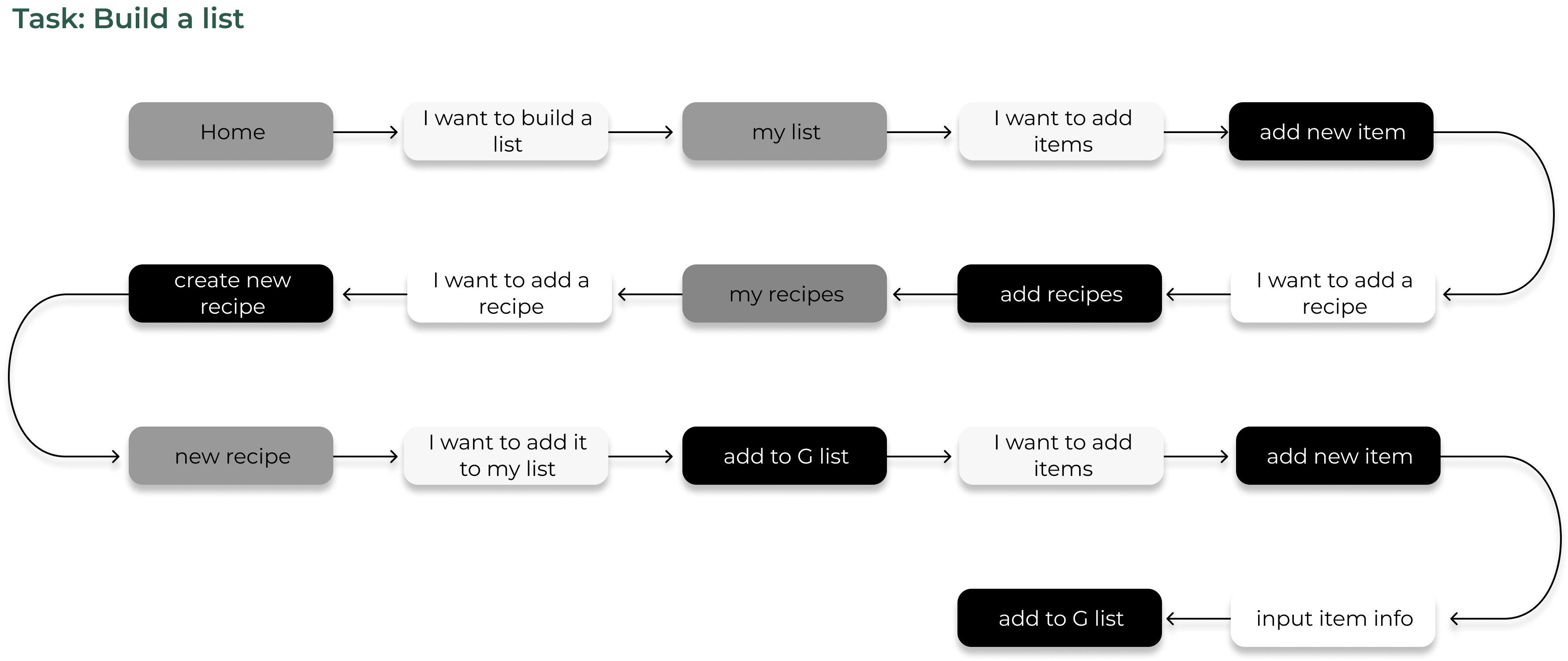
With the site map in place, and before I dove into any cumbersome wireframes, I wanted to delve into my users psyche and see if the site could answer their needs. I built my first task flow.

Right out of the gate, here is a giant roadblock. What to do? I know users want to build lists. I also know they want to add many different items in various ways to that list. So what kind of navigation would I give them? What I had learned from the research is that if the app doesn't let users customize their list, then they won't use it. That would be a problem (obviously). Here is what I came up with.

Why not give them everything they want? When the user wants to add an item they can do it one of three ways. Either a recipe’s worth of ingredients, a single item, or a whole meal plan. The advantage of this is that users will be presented with this option each time they build a new list. Through repetitive viewing, hopefully they will consider exploring the other ways. With this new idea in place I could now complete this task flow.
Sketching the future
I spent more time than usual in the sketch and wireframe process on this app. I really wanted to dig deep into how to make the app work. I knew the UI would be an important part of the app, but the real work was on the information architecture. I could have easily spent a month on just this structure itself. I started to find a real passion for this aspect of building a site.


Organizing the information was a huge undertaking. Every choice led to another that needed to go in multiple directions depending on personal preference. I realized early on that each page would require too many calls to action to reasonably live on a single page. This led to choosing the bottom up pop up tab. This navigation allowed a clear process for the user to choose their own personal path. Each user can now select their own way around the app without being lost in a sea of buttons.

All the branding and UI elements are based on ideas of fresh, clean, and productivity. The app needed to feel simple and somewhat playful. Everything is built inside a 3 color palette of orange, green and white tones. These colors promote freshness and productivity.
Listening and responding
Through the interview process it was clear users wanted the ability to share the list with others. Most users stated this was in order to make sure multiple parties could shop at the same time from the same list, but there was another response that intrigued me. That was the sharing of recipes with friends and family. Have you ever gone to a dinner party or a weekend potluck and someone brings that one amazing dish? Maybe it’s their famous apple pie or their grandmother's recipe for sweet potatoes. Have you found yourself asking for the recipe?
This became even clearer after usability testing. I asked test subjects to share a recipe and their feedback was all focused towards more sharing and less editing. So I made the adjustment to bring sharing to the forefront.

Final results
The final result is an easy to navigate app thats begins with an extensive, but not overwhelming, onboarding section. This asks the user some personal questions about their eating preferences and lets them create their user name and password. Once finished with the onboarding, the user can move to one of three sections: List, Recipes, or Meal Plan. Most users will find themselves in List and from there they can access all other sections easily. From here they will build and share their list and recipes with other users.
The Big Finish
Thanks so much for reading all the way down to the bottom. I hope you liked reading about this project as much as I enjoyed doing it.
